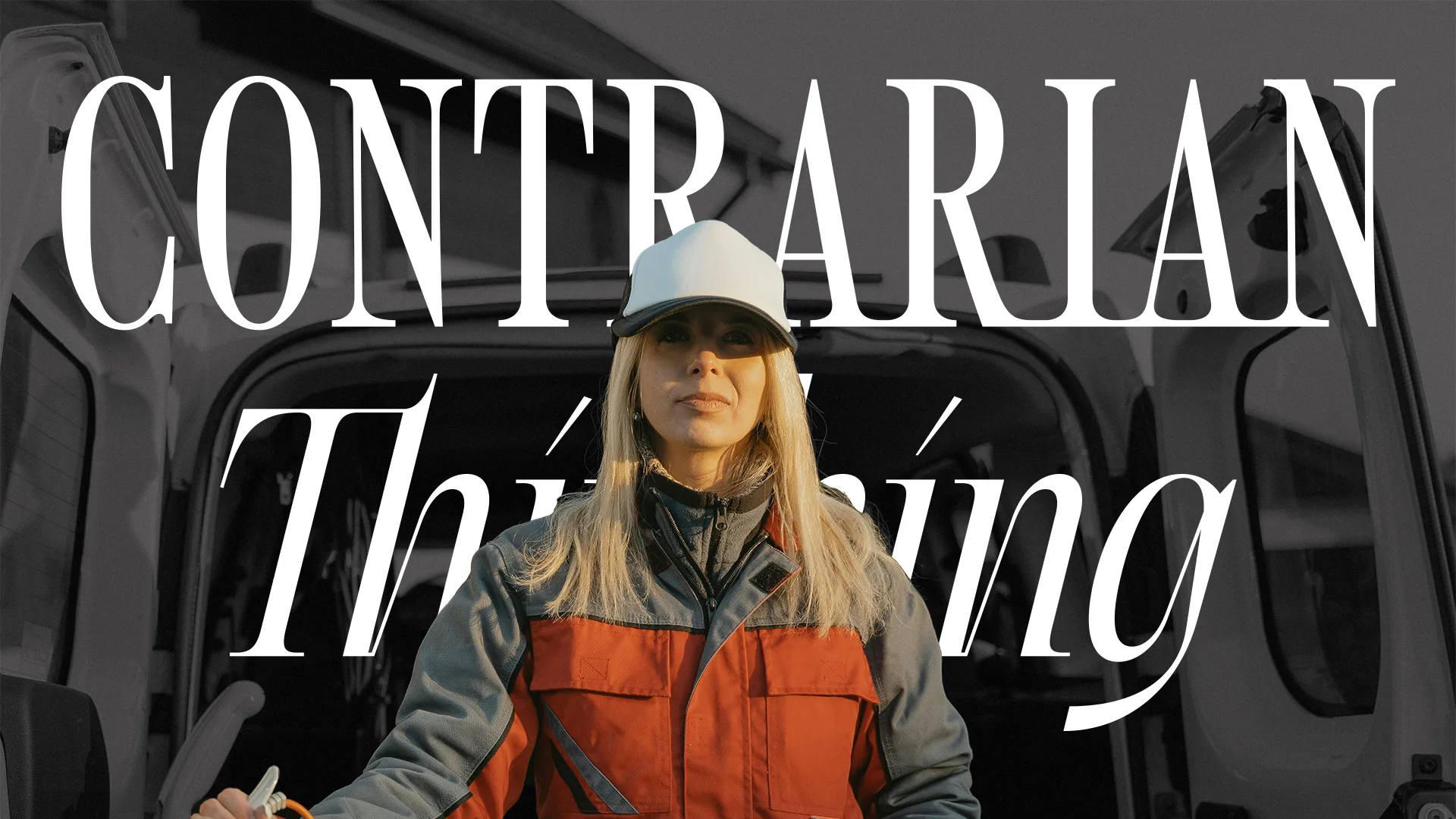
Combining tall, condensed serif letterforms of model-like proportions with a thoughtful and energetic italic serif, our logo leaves a striking, enthusiastic, and editorial first impression.
The Contrarian Thinking brand
What it is, what it means, and how to use it.
